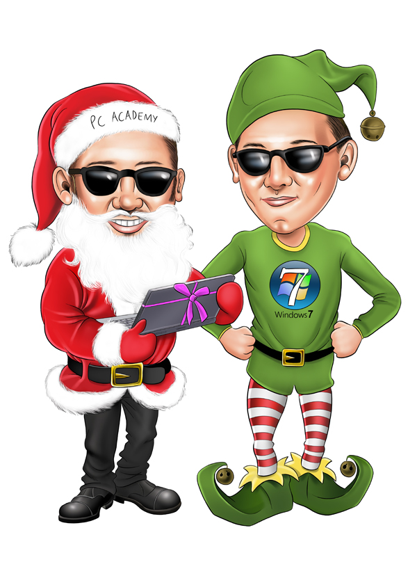
Now the fun begins as the artwork takes shape. Using the paintbrush tool I go for a largish brush size and take the opacity down to about 5% and start laying down a slightly darker flesh colour to begin creating form and depth to the face. I continue to work a darker flesh colour a little at a time to build up the face shadows. I then select red and reduce the brush opacity to 3% to wash reds into the skintones in the nose, cheeks etc and other areas where the skin tends to be redder. I continue to work in the darker areas and also make a start on the highlights so i can get a grasp on how dark the dark areas need to get. The most obvious highlight areas are the end of the nose, the cheeks, the chin and the lips. I also use a bright white for a couple of really bright spots like the cheeks and nose tip but it is mostly a paler flesh tone than the original. If its a mans face then you can also add some blue/green at 5% opacity to the beard area if needed.

Once the face is mostly completed I deselect the marching ants round the face and make a start on the clothes and hands with the same method, selecting the area to work on with the magic wand tool, adding in the dark shadow areas first and then adding the lighter colours for the highlights giving everything depth and form. Here ive completed the santa outfit, the trousers and shoes and the santa hat, the white fur on the santa outfit will be added later.
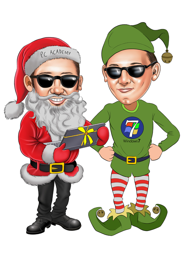
I then start work on the elf, shading in the shoes, tights, shorts, shirt, and hat.
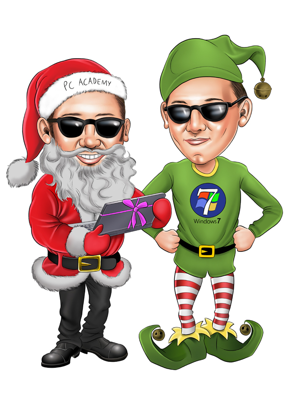
Once the whole picture is completed the work will have gotten to a detailed enough stage so that nothing requires masking and you can start on the tighter detail using small brushes and lots of zooming in and out. This is quick and fun to do and happens fast, adding all the hair into the beard areas and facial hair, highlight areas around the edges of the characters towards the light source, and maybe adding some texture to the material of the clothes and other details in the caricature. This is the beauty of drawing digitally rather than pen and paper as you can go from dark areas to highlights and quickly change colours without missing a beat. I tend to go for a watercolour look to the caricatures now rather than trying to get everything seemless and airbrushed as i used to in the past, it makes the artwork look more looser and has more energy.
It usually takes about 3 hours to finish adding the volume and detail and i’ve found the best thing to do when you’ve finished is leave it a few hours, go do something else and come back with a fresh mind and see if theres anything that needs adding or changing (which there usually is), but once im happy with it, and after lots of chin scratching and umming and arrring, i flatten the image so all the layers become 1 layer, save it as a TIFF file and its sending off to the customer or adding to the website.
So, basically the black lines define the edges and form and the colours add the values and depth of these forms. To demonstrate this, here is part of the finished artwork of the image with and without lines – and you can see that without the lines it looks terrible and messy, but with the lines added it holds everything together.
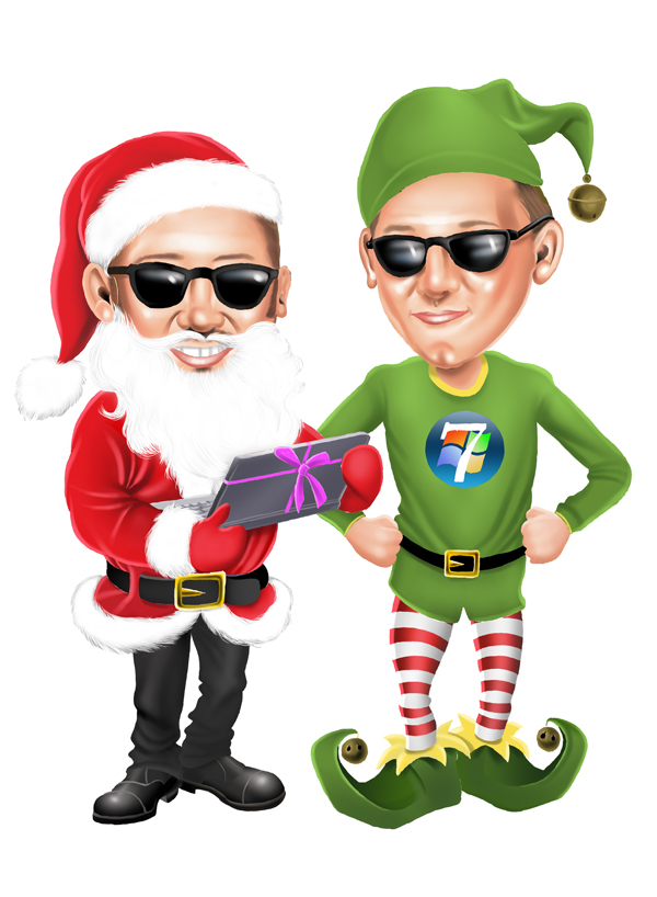
Finally here is the finished piece. The END! Sleep….
